![]() Well, after covering a lot of tips related to the initial stages of game development, I am going to cover something that people usually start off with towards the end of the game process: icon design.
Well, after covering a lot of tips related to the initial stages of game development, I am going to cover something that people usually start off with towards the end of the game process: icon design.
Your icon is the first thing that users see in the market. It needs to represent your game creatively but effectively. In this case clarity is critical. Potential users will be using your icon to decide whether the game is worth downloading or not, so having an effective icon is very important.
You don’t need to be a professional artist (or hire one) to design an icon. It’s something you could do on your own by just keeping a few points in mind.
These are some thoughts that must go into designing a game icon whether you’re someone working for Rovio on their next game or an indie developer working on the next Super Meat Boy.
- Make sure your icon ‘says’ what your game is about.
- Sketch some ideas.
- Use your main character.
- Research and aim for better.
- Don’t include words.
- Keep it simple.
- Graphical continuity is a must.
1) Make sure your icon ‘says’ what your game is about
When we started working on the icon, we had not finalised the name for the game so that was the first thing we had to settle on. So, writing down all the key things that consist in our game really helped. Then we started eliminating words based on their priority. Once we were done with that, we came up with different combinations and finally finalized on Travelling Tribal as it was easy to remember and also conveyed what the game was actually about.
2) Research and aim for better
Your aim must be that your icon must be better than the rest, so for this you need to be aware of what you are competing against. What we did was surf the category our game was to appear in and printed out a list of icons that we liked. The aim was to make sure our icons looked as professional and stood out more among them. We went through other categories and noted points that we liked about certain icons and the techniques they used to stand out from the crowd.
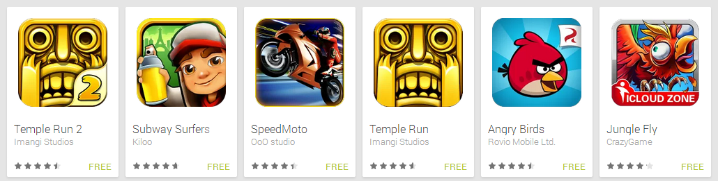
Research what the competition is doing.
The idea is not to copy the exact style but to use a few techniques. Have something you can compare against so that you know the context in which your icon will appear.
3) Sketch some ideas
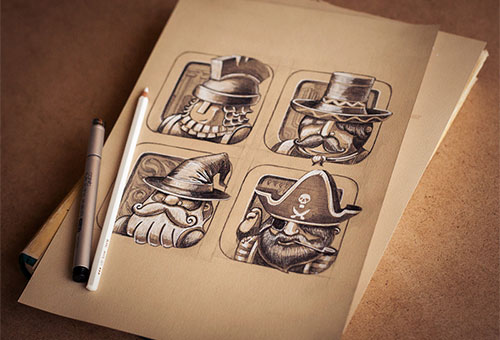
Keep that sketchbook handy.
Well, I’ve been saying this since my first article. You must always have a sketchbook and a pencil with you. So now you’ve checked out the competition, you have a list of words that the icon must ‘say’, so the best way to start designing is to sharpen that pencil and start sketching. Your aim must be to generate as many ideas as possible, and with plenty of variety.
Travelling Tribal is a 2D game in which players control a tribal character and help him travel around the world. This is done while avoiding all the obstacles that come along the way from evil tribal twins to giant bees! So with all these characters we weren’t sure which to include in the icon and which ones to not. This brings me to my next point.
4) Use your Main Character
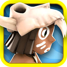
Let your protagonist be featured.
People instantly associate the game with the main character, so use it! There are exceptions like Temple Run which has an idol as its icon, but their aim was to convey the word ‘temple’ through the icon which was pretty clear. Also, there are cases where you have several main characters. If they use the same template but have different costumes, use the default one. If there are different characters, choose only one. Don’t include many and make the icon cluttered! While viewing on the phone/tablet the icon appears very small, so the components of the icon must be easily recognizable. If your character isn’t small and compact, try using just the character’s face rather than the whole body.
5) Don’t include words
Well this is something very basic, but people tend to make this mistake pretty often. Using words in your app icon simply says that you were too lazy to come up with a cool graphic that would represent your game so you just wrote down the name. Text on the icon just looks cheap and boring. The name of the game is right next to the icon , and what it does is what you write in the description. Don’t try to cramp all that up in the icon. As a rule I never use words on the icon. It may look okay in a larger size, but once you scale it down it looks really ugly- don’t forget that you’re designing an icon (the word icon comes from the Greek word εἰκών eikōn meaning “image”).
6) Keep it simple…but don’t forget to detail
Leaving off words is one way to keep it simple, but in general you ought to make sure your design isn’t too complicated. Icons are very small and if you try to fit too much into a small space you’ll end up with an icon that’s illegible and easy to ignore. Strong yet simple shapes and lines will do more for your icon than highly illustrative designs. There can be a few things that you can add to your icon. If you are trying to establish a brand, then including a logo on the icon would be a good idea. If it’s a free version, having “FREE” written would attract people. If your game has two versions – one normal and one HD – you could have a banner saying that too. In case it’s a sequel, consider using the same icon with an additional “2” written on it. Whatever it may be, choose VERY CAREFULLY. Make sure it does not look cluttered with the logo, FREE sign, HD sign and “2” which can shift the focus from the main character.
In our case, since our main character was a Tribal, we avoided using all the power ups that he has, or the obstacles he faces along the way. We just included the main character. If he’s travelling, there is no need to include the flag of every country on the icon!
It might sound like a contradiction, but don’t forget to include some detail on your icon designs. Simplicity here doesn’t mean being plain. Add a little bit of shadow here and a highlight there. Spend time on your gradients, pick out a delicious texture for the background, and add some love and attention to the bevel or emboss. Don’t be afraid to zoom right in to the pixel level and make sure it looks perfect and well formed. No pixel should be out of place. At such a small size the difference between a beautiful icon and a crappy one can be one out of place pixel. Also, just because you’ve put in all this effort for the icon, don’t be afraid to scrap a few effects for the smaller icon size, because a few effects get pixelated. Have a detailed large icon that people would see when they come to your page, but also a simplified smaller version that looks crisp on the phone’s menu screen.
With Travelling Tribal, even when we’d decided on the basic approach, I spent a lot of time playing with the details. I made improvements like:
- Cleaning up the pixels from the background to make it sharper when it’s small.
- Playing with the character’s features.
- Choosing the right shade for the background so that the main character could be clearly defined.
7) Graphical continuity is a must
Your icon is the first promise you make to the user. It says
- I am of “x” quality.
- You will do “this” in my game.
If people see a high-quality 3D character in the icon, but your game is actually a 2D game, people may get irritated. If the icon is a 2D character in HD but the game isn’t, that can irritate people too. Be honest. It’s better to have fewer downloads than have a huge number of downloads with people giving you 1-star and abusing you in the comments. The only way to ensure your users don’t feel cheated is to make sure the graphics within the game match the icon. Lying can make some really fun games unenjoyable.
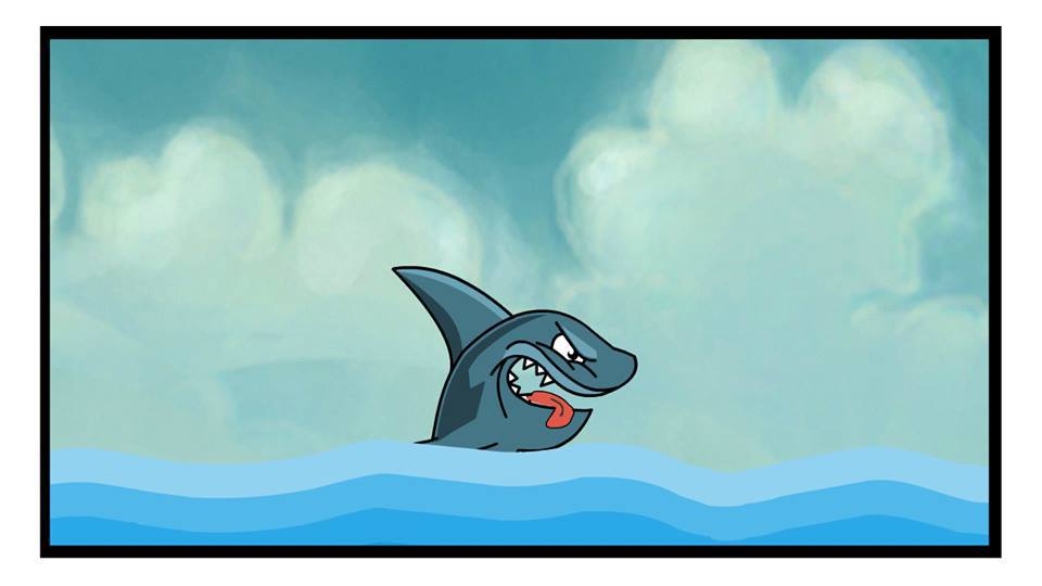
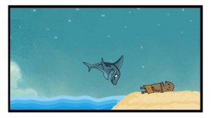
Soon, I’m going to be sharing our first teaser trailer for the game along with a lot of wallpapers up for download. Here are a few screenshots of the teaser, so stay tuned.

Have you applied these tips to your icon design? Share your images in the comments below.
If you hear a voice within you say “you cannot paint,” then by all means paint and that voice will be silenced. –Vincent Van Gogh
© 2013, The Indie Mine. All rights reserved.
